This is from 2012 | 9 minute read
Understanding And Infusing Product Character Through Stance
There's a strange and highly subjective quality to digital products, one that floats between brand and utility. It's the idea of stance: the attitude the product takes, the personality it has. Stance is manufactured and designed, and from a particular product stance flows features, functions, language, imagery, and other formal design qualities. Stance is similar to, but different from, market fit, usability, or usefulness. Stance can be applied purposefully, or haphazardly; it can evolve from an existing brand language, or it can be created from scratch. Product stance can evolve from an understanding of users, from understanding of market, or from the attitude and approach of an individual designer.
First, Identify the aspirational emotional traits you would like your product to present to the world. There are lots of ways to identify these traits, and how you go about identifying them will depend heavily on the style and culture of your product team. Is this a team that embraces an analytical, engineering approach to design? Is this a team that looks to the market for guidance? Is this a team of one—you—where your vision is driving product development? Or, do you have an existing brand that comes loaded with existing attitude? The culture of your product team will indicate the spark of stance: it explains how to start.
Consider:
| If you work for a large, well established company... | ... your brand language already exists... | ... and this existing brand language will directly lead you to the aspirational emotional traits. |
| If you work in an engineering culture... | ... the team will expect and respect an analytical approach to process... | ... and you will need to rationalize the aspirational emotional traits you select based on data |
| If you work in a marketing-driven culture... | ... the team will look to the competition and overall market landscape... | ... and you will need to visualize opportunistic whitespace as a way to justify the aspirational emotional traits you select |
| If you work in a tiny team... | ... you'll have a lot of freedom to make decisions on your own... | ... and so you'll need to have a strong opinion about the type of emotion you want your product to exude |
I've found that identifying four or five extremely specific traits works well, and the more specific they are (and the more of them you have), the more useful they will be.
Consider an easy set of examples: compare the aspirational emotional traits for a Lexus and a Mini Cooper. Lexus is a luxury brand, but "luxury" only gets us to a vague emotional feeling. Consider that the Lexus wants to be luxurious, sensual, coy, aloof, elegant, smooth, romantic, and slightly out of reach. The Mini Cooper, by comparison, exhibits childlike wonder, carelessness, and lightness; it wants to be spirited, light-hearted, playful, and free.
Next, use the aspirational emotional traits to establish emotional requirements. Like functional requirements, these describe aspects of the product or service that will be built, and like functional requirements, you can test to see if these requirements have been fulfilled after a product is complete. These emotional requirements take the form of sentences of fact—"Our product will"—and you can introduce these requirements into the same story, point, or defect tracking systems you already use. The difference between these emotional requirements and functional requirements, however, is that emotional requirements are omnipresent. They exist across every use case, in every facet of the product, and dictate, describe, and artificially contain every other product, quality, usability, marketing, and design decision that follow. Simply, they trump everything. Mike Kruzeniski has described these as the "soul" of a product—no matter what gets cut due to timing, budget, or market constraints, these things cannot be eliminated, or you have no product.
Here are some examples of emotional requirements that might follow from the traits described for Lexus, above:
Our product will always be revered in a crowd.
Our product will be highly tactile, almost erotic.
Our product will always tempt users to do slightly illogical things.
Our product will always let users feel in control, but will always actually be controlling the users.
These statements act as if the product was a person: they create a sense of identity for an inanimate object. They become the structure of personality.
Then, use the emotional requirements as a set of constraints to determine product features, pricing decisions, content strategy, launch priorities, and so on.
These requirements become the way you argue for and select product features. Should the product come in high-saturation, day-glow colors, or—given the above requirements—would a more sensual, rich, subdued color palette make more sense? Should the speedometer stop at a standard setting, or should it go up to 220mph? Should the sun-roof be an option, or should it come standard?
Additionally, the requirements become ways you argue for and select product interactions. Touch-screens don't seem appropriate in the vehicle described above, but subtle dimpling, extremely detailed textures, and smooth transitions with recessed details make sense.
These emotional requirements become the arbiter of arguments, the way product teams move forward. The product comes alive, because it now has personality: it is no longer inanimate, and it has opinions about how it should be shaped and formed. Major inconsistencies act as they would in a human: they seem surprising and difficult to rationalize.
A strong product stance capitalizes on two of the most important qualities of product development: framing and play. A frame is an active perspective about a situation, person, or product. We frame experiences all the time. This is how we get through life—by actively considering what's happening in front of us, and implicitly applying our own lens or filter on top of a given situation. Framing is a part of being human, and while there's a constant demand in western civilization to "be objective", objectivity is probably an unattainable goal, at least in the midst experiencing something. Play is the idea of exploration for exploration-sake: examining and considering different results, simply to see what happens. When you consider framing and play together in the context of product development, you arrive at a place of opportunity—opportunity to reframe a situation from a new perspective, just to see what happens. And when you assign that new frame to your product, you implore it to act in a consistent manner, as a form of personality. If the personality has consistency, and the emotional richness of the stance seems credible, the user will experience a rich interaction with your product. And if the user experiences a product stance with resonance, the aspirational emotional traits will be transferred to the user. A playful, provocative, unexpected frame will resonate with a user who wishes to be playful, provocative, and unexpected; or, a user will become playful, provocative, and unexpected by using the product with this stance.
I selected a non-digital product—a vehicle—for an example on purpose; the aesthetics of a car are obvious, and so the personality decisions are overt, amplified, and obvious. A digital product is much more subtle, and the opportunities for this stance to have a lasting and deep impact are much greater.
Consider these examples.
Several years ago, Burger King teamed up with Crispen Porter to create the "Whopper Sacrifice": a campaign that asked users of facebook to sacrifice their friends in exchange for free hamburgers. If you sacrificed a friend—say, Joe—the message would show up on your facebook wall: you thought a free hamburger was worth more than your friendship with Joe. As much as Whopper Sacrifice was a product, the product exhibited a highly irreverent product stance. And that irreverence was transferred to the hundreds of thousands of users who elected to sacrifice friends for burgers.
When Clippy would dumbly ask you, over and over, if you were writing a letter, it was exhibiting emotional traits that most people find abusive in real people. Its repetitive, dumb, questions, and its poorly animated qualities were familiar human signals of a person most of us wouldn't want to spend time with, much less become.
When you use MailChimp—a tool used to send mass mail to a mailing list, the product acts as a playful friend. Consider that, when you elect to preview your mail, if you stretch the screen too large, the robot's arms fall off.
Tumblr doesn't allow comments from people that you don't know. And when you ask the design team at tumblr why that is, they describe a response based on aspirational emotional qualities: comments on the internet are poisonous and seem to entice vitriolic response. Tumblr is about sharing things in a positive environment. Open comments don't fit with the aspirations of the product. The people that use Tumblr aren't looking for deep, meaningful rhetorical debates; they are looking to delight in sharing.
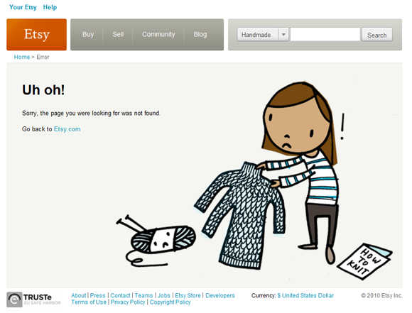
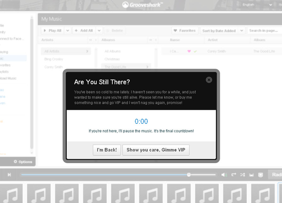
Sometimes, you see misaligned glimpses of these aspirational product traits through product features and functions that don't reflect the whole, the gestalt of the personality. error pages commonly have a sense of attitude, even for the most benign product; my experience tells me this is a product team begging to introduce life into their tools, at the expense of a larger conservative or analytical culture. I collect these, here are a few:


I don't collect these just because I think they're fun. They actually indicate a strong desire by product teams to infuse more character, more personality, and more soul into the things they make, and an increased prevalence of this type of attitude would indicate a sea-change in product development. As innovation is one way of avoiding the trap of "commodity hell", to quote Jeff Immelt, so too is product stance. I don't think stance can be faked or copied, because it's largely institutional and organizational. It's in subtleties like language choice, and it manifests (or doesn't) in consistent ways over time, building a larger personality for a product and, ultimately, a brand. I don't see stance coming through rapid development practices, from the grip it and rip it of agile, or from the "throw it to the market as fast as possible" of lean. Stance takes time, and care, and is probably at odds with approaches that emphasize time to market and the overzealous optimization of SEO or A/B testing. Stance is a designerly way of thinking about products.
Originally posted on Mon, 28 May 2012